After a short hiatus from my "gratuitous" feature, I am back with a new candidate. It was actually a pretty easy selection as I am still surprised at what I see.
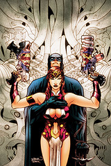
Superman/Batman is usually more action driven, and I am used to seeing covers that reflect that. What caught my attention after getting used to the provocative pose was the fact that the cover appears to be either a "fold over" like Mad Magazine used to have, or the artist used a mirror image on both sides to give symmetry. Either way, this cover has a shock value.
Normally I don't associate Batman with a hot and bothered look like this, so that makes it even more surprising. Dustin Nguyen is an artist that I have always appreciated for his flow. I didn't recognize this as his work at first. It just doesn't fit what I find to be his "norm". Maybe that could be a good thing? Maybe not??
I am fearful that my local retailer is going to hide this behind the counter when it comes out. The pose gives off a definite sexual vibe, and the weaponry just sends it home. I will let you know if my retailer does indeed hide it.
On that note, I am asking for your valuable opinion once again.
Is this gratuitous?
Friday, September 14, 2007
Subscribe to:
Post Comments (Atom)


14 comments:
Eh my eyes went to the guns first and then the boobs...so I am gonna say kinda gratuitous.
I'm having a hard time seeing Batman's pose as sexual. It's just awkward. I assume he his holding her as to take her with him with the grappling hook, but in that case his hand should be on her waist.
Clearly the female character is intended to be sexy but the interaction with Batman make the cover more confusing than exciting.
Gratuitous perhaps...but plenty creepy. It makes Batman look like some pervy old man.
It's a wierd cover. It could be beautiful, yet there's just something off about it, and that's before we take into account the excessive clevage.
Wrote about this one back in June.
The figures are OK I guess, it's that giant cybernetic vagina behind them that tripping me out.
I'm with Lisa. It's too weird for me to focus on the sexual content. And this one's not weird in a good way. Ben Templesmith does weird in the good way. It looks like he was going for a J.H. Williams thing and didn't quite make it.
So...gratuitous and hard to figure out.
I'm not getting a sexual vibe from it at all, unless the presence of cleavage in itself is supposed to spell sex -- which probably wouldn't be a popular argument except among fundamentalists of various stripes.
I appreciate your opinions on this very much as I was flummoxed and shocked last night. The portrayal of Batman here is indeed creepy. If the boobs are there to make him sexier, it has failed miserably.
I feel that this is "partially" gratuitous in the fact that the portrayal of Batman is so out of character with my perception of him. If asked, I would say that the mission of this cover is to sell issues, not bring across the story being told.
Make sure and check out Jonny B's take on it.
Thank you for your brilliant opinions on this mess.
Actually, to me, it's not the woman who's being used gratuitously, but Batman. He seems way more "passive" in the image. Her serious and no nonsense look would obviously paint her as the dominating one in the image. I can almost see the word balloon above her head reading, "Now, mortal, pleasure me and make it good, or by the power of Darkseid crimson gaze, you will suffer!"
Who'd ever have thought we'd see Batman playing the role of the submissive on a cover to one of his own books? Color me shocked. ;)
Did you get your copy and notice that on the cover Batman does not have his hand on her chest? It's true. Check it out.
Lisa:
Well, that just shows you the clout Heidi has within the industry. She speaks, they listen (and readjust when needed). ;)
Seriously, that's pretty interesting that they changed the cover, but it's not the first time. They did it before with that Justice league Of America #10 (you know, the cover with Power Girl). They had planned to change it, even before the hoo-ha over it happened. This issue didn't even have that going for it and it was changed. I have to say, I don't mind these types of things, as long as it is a choice being made by the company and not strong-armed on them by irate interwub agenda-fans. I want them to do what's right because THEY see the merit in it, not because someone else is dictating what they can and cannot do.
This is obviously a case of the former and I appuald DC for making this chnage of their own accord.
Lisa!! Holy Crap!! I saw that after you mentioned it and I about died! My retailer was astonished as well. Interesting change, huh?
You are very astute to catch this! I almost called your store when I saw your comment, but restrained myself because you may have thought I lost my mind!! :-)
It's just a bad cover. Well-rendered. In fact, it's gorgeously rendered. But the static posing and the overly symmetrical composition just kills it. It looks lifeless and dull.
The boobs are definitely being emphasized, so I'd say you can make a good case for it being gratuitious... but actually given the stiff formality of it all, there's nothing particularly sexy about it.
Unless one is attracted to mannequins or waxwork figurines. Which is probably a totally different comic altogether.
Post a Comment