It is time for another cover as we prepare to play this week's version of "Is this Gratuitous?".
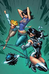
Featured this week is the cover of Worldstorm #2 by J. Scott Campbell. What makes this gratuitous for me to start with is the lack of a bra on any of these characters. The other reason is the suspicious lack of underwear on Voodoo, the middle character.
Some people might just pin it on Campbell doing the art. That could be right. Others may think it is pretty tame. It depends on your perspective.
So let me know, Is this Gratuitous?
Thursday, April 19, 2007
Subscribe to:
Post Comments (Atom)


11 comments:
Guess I'll be the first to comment.
Yeah, I'd say it is, since you have Voodoo strike one of her stripper poses. Sure, that may have been her original vocation and all, but you'd think that since this series isn't just about her, that they'd do something to give you an idea of what the story is about. Heck, just having the women stkie a heroic stance would be better than what we get here.
I'll have to say Yes also. First of all - I have never, in all my life, seen a T-Shirt fit the way it does on Voodoo. My store is next to a tanning place where all kinds of gals in all kinds of outfits walk by, and I've NEVER seen a T-Shirt form-fit to anyone's breasts. MAYBE if it was wet, but even then, that's quite the crazy fitting T.
They must also be in an EXTREMELY cold place. I'm sure you know what I'm referring to here.
And WHAT are those girls doing? Dancing or fighting? I can't tell.
Grat.
Voodoo's Tshirt is like that liquid chocolate that turns hard on ice cream. Not the way fabric really works!
I dunno but it sure is stupid
Well, let's examine "gratuitous" ...
(1) given unearned or without recompense ... hmm ... that gets a "yes" (2) not involving a return benefit, compensation, or consideration ... well ... if some form of prurient arousal is a "return benefit", I'd say it fails that definition (3) costing nothing; free ... true, thanks for posting this online and allowing us to see it gratis.
Lastly, we come to (4)not called for by the circumstances or unwarranted. And that's where this cover really falls down. These women have weapons and are presumably dressed for battle, but they aren't ... they're dressed for the gratification of adolescent fantasies. If you're swinging a mace and looking to kick some ass, you wear ARMOR, not some silly, form-fitting costume.
Sex sells, and that's precisely what the cover of a comic is supposed to do: sell its contents. That said, this cover does nothing to advance information about the story while it does everything to coax your mid-brain into getting out your wallet.
Lisa and Redhead- that is totally the thing about this cover. Shirts don't usually fit like that in real life unless it is latex!! :-)
Swinebread- Amen. You said it.
Virgin, I love your comment so much I can't think of anything else to add!
I've seen shirts like that before, usually in horror movies or teen sex comedies where they are about a size S on a gal that usually wears an L. Oh, not part of reality either? I think it's another dopey cover especially with stealing the spike-ball from Kill Bill V.1...
I looked at this a while and for some reason I don't think it's that bad. It's flashy and as folks pointed out highly unrealistic with how the clothing fits... maybe I'm just desensitized with Campbell. As much as I dislike how he dresses women, I have to say he did a great job on the color choices on this cover.
Gratuitous. The characters on the left and right look ready to go into action, but the center character looks ready to do a lap dance.
Post a Comment