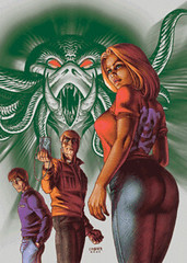
This week's candidate for gratuitous consideration is Consumed #1 from Image. The reason for it's nomination is not neccesarily the booty in the foreground of the pic, so much as it is the dude's eyes and where they are glancing. There are several variables here. At this point, I am really torn. As a big fan of Linsner's art, I appreciate the asthetic value, but from a strictly neutral point of view, I see where there could be problems.
Here are the specs on the issue:
"Written by Asa Shumskas-Tait, art by Dennis Budd and Joe Caramanga, colors by Stu Chaifetz, cover by Joseph Michael Linsner.
When nerdy Oliver falls in love with beautiful Casey, he has no idea that she's been marked by her ex-boyfriend Gavin to be possessed by Kavaleth, Lord of Kaos. A supernatural drama about the consumption of love, desire and power plays out in this demonic love triangle!"
Did anyone purchase this book? How did the cover match the story? What did you think?
Is this gratuitous?
Thursday, July 12, 2007
Subscribe to:
Post Comments (Atom)


6 comments:
Lessee, she's
1) twisted to show the maximum simultaneous T & A at the same time
2) put in the front of the scene, BUT
2a) posed so that her butt is the most important visual element in the scene, *not* her face,
2b) posed so that her tits are the second most important visual element in the scene, not her face again,
2c) painted so that the shiniest thing in the whole picture, let alone her figure, is her big round butt,
3)standing in a totally passive, "look at my perky tits!" manner, leaving no question that the only reason for her existence is to be ogled and fought over by guys.
4) Would a male character be posed in such a way, do we really think? Depicted as an object without agency, and so as to focus viewer attention soley on sexual traits? After the darkening-down of Citizen Steel's shiny 3d bits?
We women really don't have to just be T&A, in visual or in narrative art. But you'd never guess that from this cover...
Anytime a character is posed to show off both ass AND tits I'm just gonna lay a blanket "Yes its gratuitous" on it...
For me, it's not so much her pose that I find to be gratuitous (in fact, compared to others it's VERY mild). She isn't bent in some near-impossible, only a cover-model does to look sexy. Plus her proportions are pretty evened out (i.e. no internal organs look to be missing), which is something Linsner is really good about.
No, what bothers ME about the cover is the two guys leering at her on it. I know the story has a love triangle to it, but the way they are staring at her, just doesn't seem right (even though the guy farthest back and to the left looks to be popping some wood over what he sees).
It's one thing to make the gal look sexy (and she does), but quite another to make other characters stare at her in a very obvious and sexual manner. That is what I find gratuitous about this cover. YMMV.
So far, I would have to declare this gratuitous for sure. Bellatrys, nice post! Lurkerwithout- you made me smile! Jim, always good stuff!
This cover is one of my favorites, inclusive over Generic Viagra #12, and thrust me, that was really cool.
It is an amazing cover indeed, what grab me was the snake of the background, also the eyes of the people in the background.
--------------------------------
viagra online
Post a Comment