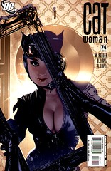
When I bought Catwoman #74, something seemed funny to me. I hadn't remembered seeing such a bodacious cover- it had seemed to me that it was more "arty" and serious.
Then I figured out why I had that suspicion.
I went to DC Comics online site and prepared to show the cover here. To my surprise, the original cover had Catwoman's front completely zipped up. The pose was also a bit different, and her expression was more sinister then sexy.
That kinda pisses me off.
Does anyone know why DC had such a radical cover change on this issue? Has there been any news about it? Or was this just simply the case of the good old switcheroo?
In my mind, changing this cover so radically from solicitation to publication makes me smell a rat. It isn't so much the boob centered finish of this that bothers me; it is the fact that a really cool noir style cover is now a titillating one.
Now it is your turn. Weigh in on this one and tell me what you think it all means. Also tell me this: Is this gratuitous?
Quick note: The cover here is the actual one. For solicit cover, hit the link of go to my Flickr page.

22 comments:
The funny thing is that I saw this and thought to myself how happy I was that we were no longer suffering the stripperific Balent-era covers.
(Examples chosen at random
http://www.thebatsquad.net/catwoman/catwoman1994.htm)
Nice catch.
And this is odd behavior. Did people complain about NO cleavage on the cover?
That is a nice catch. I just posted about this and complained that I wish there had been less cleavage. It's strange that there once WAS less cleavage! I do like her facial expression better, though - it makes her look like Audrey Hepburn.
I have to admit to being startled by this cover change. I quite liked the "zipped up" version, as it had a feel of mystery about it. Unzipping her didn't enhance this for me.
It just absolutely befuddles me and astounds me.
Thank you for the kind words, BTW.
Happy Holidays!
The first cover was GORGEOUS. This remix... Why? Just why? What on earth is wrong with the world when Adam Hughes drawing f'n CATWOMAN needs added smexy?
And yes, gratuitous. Sadly.
I also note that her waist seems smaller... By at least a few inches, it looks like.
Wow...yeah...I didn't even know what the original cover looked like..and thought this one looked out of place anyway. Guess I know why now.
I honestly think this was a very conscious choice of DC and after reading this issue I also think DC editors got their claws into the overall story...I mean you have a perfectly good story and it's flowing nicely and just when it reaches the really good stuff...the Suicide Squad kidnaps her, to take her to Planet Salvation? Wha?
that's so bizarre. the original was so nice and noir.
cleavage sells I guess
Wow!... If this wasn't on a reputable blog I would assume it was a photoshop sight gag... That's crazy!
I can't imagine any reason behind that change that wouldn't be gratuitous!
I think Greg's right, though. The head/face looks better.
I like both covers, to be honest. I mean, the Catwoman covers have been a place where you can be vampy, noir, sexual, & competent, all at once. I'm not going to cry foul. It IS weird, & if there was a pattern of covers being...what is the opposite of neutered? DON'T SAY SPAYED. Anyhow, if it turned into a trend, that would suck, but you know, I don't mind a boobilicous cover here & there.
That's quite the difference. Personally, I prefer the original solicit. The new one looks like a photoshopped model while the solicit looks like something that was actually drawn, and drawn quite well I might add.
I haven't read it, so I don't know what the story's about, but the first cover seemed to promote a noir tale of theft in progress while the new one makes it seem she is just so turned on by herself in the mirror she just might forget about the safe. Either way, I'd read the story, but I'd prefer the first one...
If you look closely at both covers it's obvious that the one up at DC is a preliminary version. Compare the detail in the frame, for example.
It's likely that that this cover was sent to the editor for approval and he asked for the changes. There's any number of reasons why the website showed the preliminary rather than the final cover. But it's not like that's a rare event.
So no great conspiracy, but undoubtedly gratuitous.
AH has been doing this switch with Catwoman covers for almost his entire run on the book. He'll send up a good looking mock-up that gets published in the solicits, then the final is different, sometimes quite different. A fan over at the DC boards Catwoman section actually demonstrated a series, side by side. I'm getting kind of sick and and tired of how AH almost always draws her goggles up and suit unzipped, in situations where that is out of context. It would like if Batman went around with his mask scrunched up and belt buckle undone most the time. Retarded, is what.
As for why the cover gimmick, sales dropped again to 18k for this book. They're probably scrambling for some last ditch sales hikes. I don't think this book is worth the bother, anymore because Pfieffer writes it pretty much the same way he did Amazons Attack.
I almost feel like the change in expression is worse than the cleavage.
Well, you know, it's always a rare treat to get sight of your own cleavage as you burglarize a site with your mask off and work clothes undone.
Or maybe it's trying to demonstrate that Selina approves of the [male] gaze. Because that's so subtle.
If you are going to be pointing fingers or arguing about Adam Hughe's methods, than perhaps you should know the facts beforehand.
Adam Hughes often does a preliminary thumbnail sketch, for most artists they are really small, but Hughes tends to do them larger (on a letter size piece of paper). Sometimes, if time is not there he just colors the prelim for solicitations (instead of showing nothing at all).
So the solicited image was really just a prelim and the final artwork was not finished/or started. I do know however that this thumbnail may be a little bit old, the shadow looks as if it was Catwoman with Batman behind her, but in the final it is just her created for issue 45 (30 issues before... the one being debated about).
http://justsayah.com/images/CW4SK.jpg
Enjoy!
*roll eyes*
Catwoman has always been a sexy character, and her sexuality has been a HUGE part of her persona.
I can't believe someone complained about the Balent years. Balent-era Catty was so much better.
*sigh*
Well, this new run is coming to an end. Maybe version 3.0 will be a return to the proper style.
somehow juxtaposing Audrey Hepburns adorable, European face - which I think is a great touch for catwoman - with gratuitous cleavage is a bit indecent. This is my favorite Catwoman, the new suit actually serves a function, so this cover art struck me as a bit exploitative. Still though, very realistic. I don't feel gross for having the hots for pen and ink.
This comic books is one of my favorites, principally by the sequence of the story. I like the part when Catwoman rescue Generic Viagra Universe, it's simply perfect.
This cover is more gorgeous, a few more detailed, and honestly it makes Catwoman looks sexier. I definitely are not gonna need Generic Viagra , after see this I stayed totally excited.
Post a Comment